This year’s PBX was so much fun! There were many new and exciting products debuted. I was very excited to visit the Picture Mosaics Booth to see their new products and the changes they have made to their SketchBot. SketchBot is ‘The AI Robotic Sketch Artist’ that uses the latest mesh of A.I. and machine learning to draw guests’ portraits. I also noticed there was another company has tried to release a similar product. So in this post I will review Sketchbot vs the “other” solution.
Although our review pages are very informational and helpful, there is nothing more concrete than a side-by-side comparisons.
Instead of using digital versions of the mosaics, we decided to take high resolution digital pictures of each printed mosaic; in this way the final results are more easily understood and revealed. Each printed mosaic was mounted on a black foam board.
Below you will find three views of each mosaic that was reviewed:
1) A distance view to see the overall target source clarity
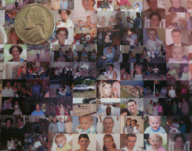
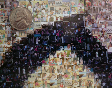
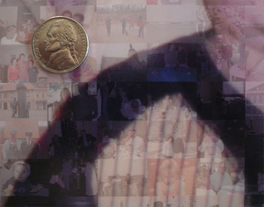
2) A close up sectional view to see the cells and reveal how each mosaic is created
3) A super close up for detail/clarity and resolution (dpi)
Distance Views: Although all of the mosaics look similar at first glance, it is soon becomes clear that one of these maintains more true colors and vividness compared to the other three.
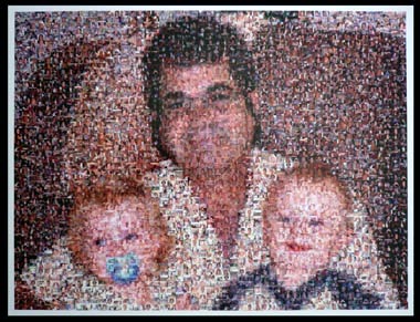
Picture Mosaics (above): Using only a grid of 51 by 51 cells (2601 total cells), this mosaic had the clarity and vividness that make this mosaic stand out from a distance. None of the orginal colors were muted or colorized. The overall clarity of the source image was remarkable. Also, this was the only mosaic printed with a border (white) in addition to the print area to allow for easy framing.
|
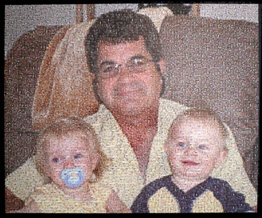
Big Mosiacs (above): Using a grid of 96 by 80 cells (7680 total cells) this mosaic had ultra small cell photos, the smallest we have ever seen! Source clarity from a distance was good, however since the mosaic had so many cells, the cells were too tiny to see. The mosaic was printed on a high gloss paper which produced so much glare that we had trouble viewing, and photographing, the mosaic. The cells on the outside edge of the print were cut in half (borderless), and made framing a challenge.
|
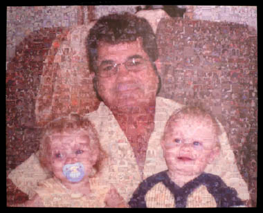 Design A Mosaic (above): Using a grid of 27 x 28 cells (756 total cells), this mosaic was very faded and lacked that wow factor. It was clear, even from a distance, that the target source image was superimposed giving the mosaic a fake appearance. The source image and it’s colors were so superimposed that the cells became difficult to identify since they were so faded.
|
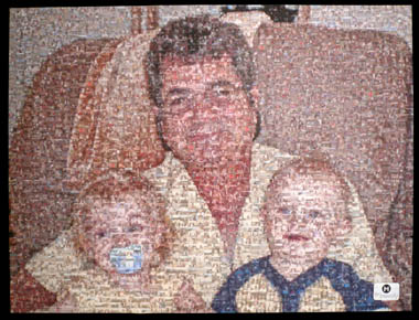
Mosaically (above): Using a grid of 52 by 53 cells (2756 total cells), this mosaic looked good from a distance and had good color/contrast attributes. Something we quickly noticed was the loud permanent sticker of the company logo in the lower right hand corner, which we assumed to be advertising. It was also clear that quite a bit of colorization/superimposing was used, which detracted from the overall mosaic effect.
|
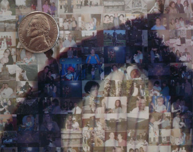
Close Up Views: In this view, we positioned our camera about 6 inches from the mosaic to reveal a close section view of each. We also placed a US nickel to help with perspective and sizing on different monitors. The nickels are the same size in each image for easy comparisons. We found some interesting (and somewhat undesired) techniques used in the creation of each mosaic.
|
|
|
|
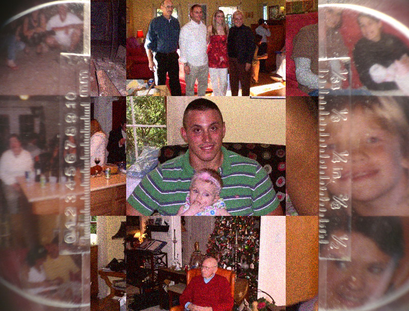
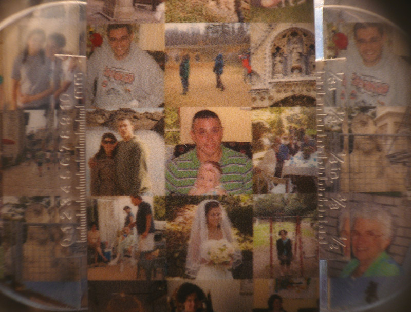
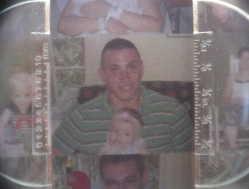
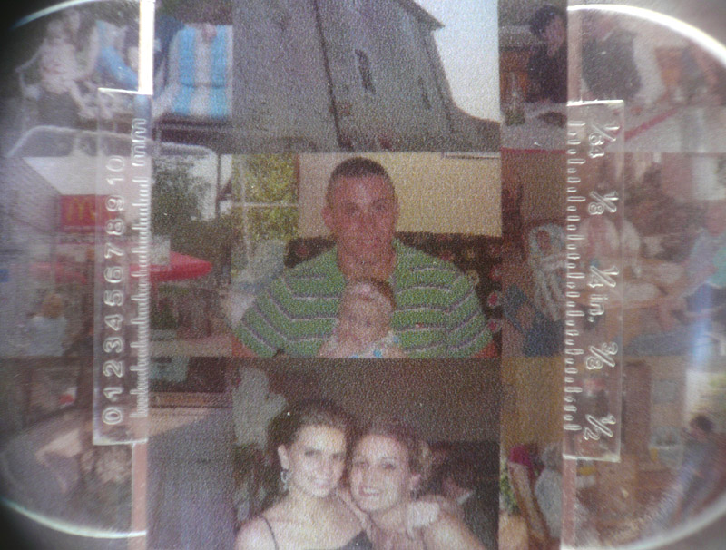
Super Close Up Views: In the views below, we use a 10x Loreo Lubot (a photographer magnification lens) to explore the actual print resolution (dpi) of each mosaic. The greater the dpi (dots per inch), the clearer and sharper each cell photo can be. The results are pretty clear (no pun intended).
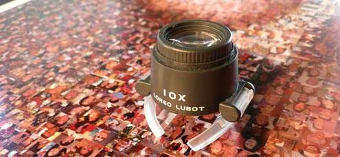
Above: Our 10x Loreo Lubot to study the print reolstuion (dpi) of each mosaic.
