I’m excited to share the new adventure I’ve decided to take on for 2017. I signed up at my local high school to give a presentation to the art students, on photography techniques & best practices – tips on how to improve their photo skills.
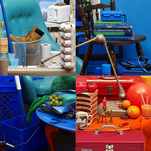
Have you ever looked at a photo or a piece of art for what feels like an eternity? Your eyes continue to scan over it. There’s something about it keeping you fixated, but your mind just can’t seem to grasp its mystery. In my web-travels, I stumbled upon an article on PetaPixel featuring the work of Bela Borsodi, a New York-based photographer who has particularly framed this photo to yield very interesting results!
Although our review pages are very informational and helpful, there is nothing more concrete than a side-by-side comparisons.
Instead of using digital versions of the mosaics, we decided to take high resolution digital pictures of each printed mosaic; in this way the final results are more easily understood and revealed. Each printed mosaic was mounted on a black foam board.
Below you will find three views of each mosaic that was reviewed:
1) A distance view to see the overall target source clarity
2) A close up sectional view to see the cells and reveal how each mosaic is created
3) A super close up for detail/clarity and resolution (dpi)
Distance Views: Although all of the mosaics look similar at first glance, it is soon becomes clear that one of these maintains more true colors and vividness compared to the other three.
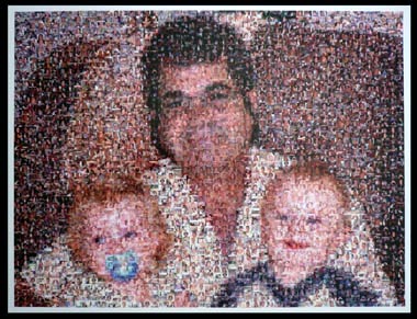
Picture Mosaics (above): Using only a grid of 51 by 51 cells (2601 total cells), this mosaic had the clarity and vividness that make this mosaic stand out from a distance. None of the orginal colors were muted or colorized. The overall clarity of the source image was remarkable. Also, this was the only mosaic printed with a border (white) in addition to the print area to allow for easy framing.
|
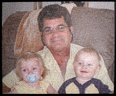
Big Mosiacs (above): Using a grid of 96 by 80 cells (7680 total cells) this mosaic had ultra small cell photos, the smallest we have ever seen! Source clarity from a distance was good, however since the mosaic had so many cells, the cells were too tiny to see. The mosaic was printed on a high gloss paper which produced so much glare that we had trouble viewing, and photographing, the mosaic. The cells on the outside edge of the print were cut in half (borderless), and made framing a challenge.
|
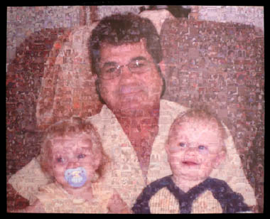 Design A Mosaic (above): Using a grid of 27 x 28 cells (756 total cells), this mosaic was very faded and lacked that wow factor. It was clear, even from a distance, that the target source image was superimposed giving the mosaic a fake appearance. The source image and it’s colors were so superimposed that the cells became difficult to identify since they were so faded.
|
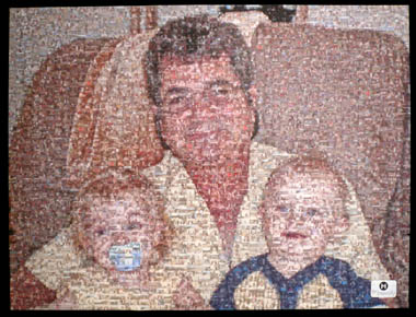
Mosaically (above): Using a grid of 52 by 53 cells (2756 total cells), this mosaic looked good from a distance and had good color/contrast attributes. Something we quickly noticed was the loud permanent sticker of the company logo in the lower right hand corner, which we assumed to be advertising. It was also clear that quite a bit of colorization/superimposing was used, which detracted from the overall mosaic effect.
|
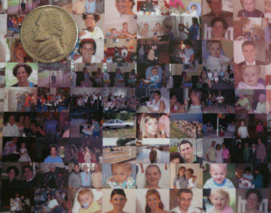
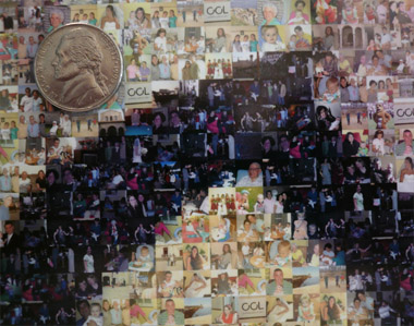
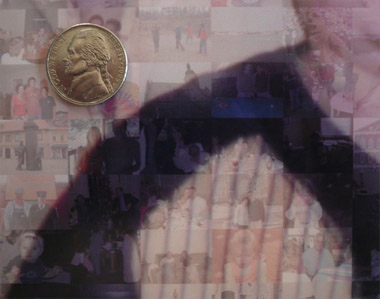
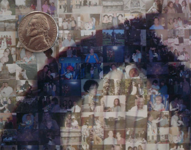
Close Up Views: In this view, we positioned our camera about 6 inches from the mosaic to reveal a close section view of each. We also placed a US nickel to help with perspective and sizing on different monitors. The nickels are the same size in each image for easy comparisons. We found some interesting (and somewhat undesired) techniques used in the creation of each mosaic.
|
|
|
|
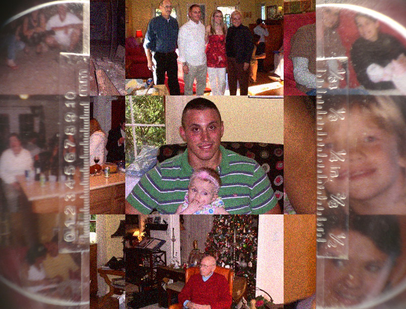
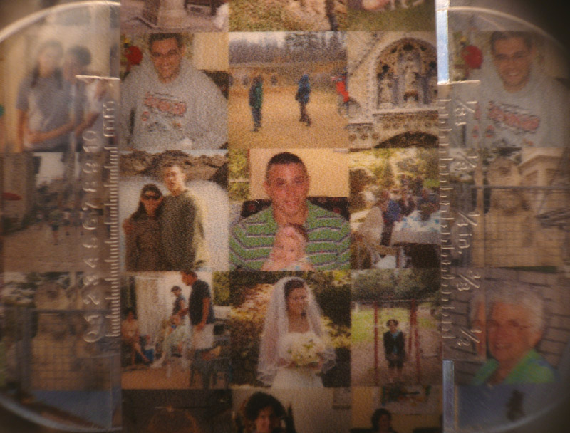
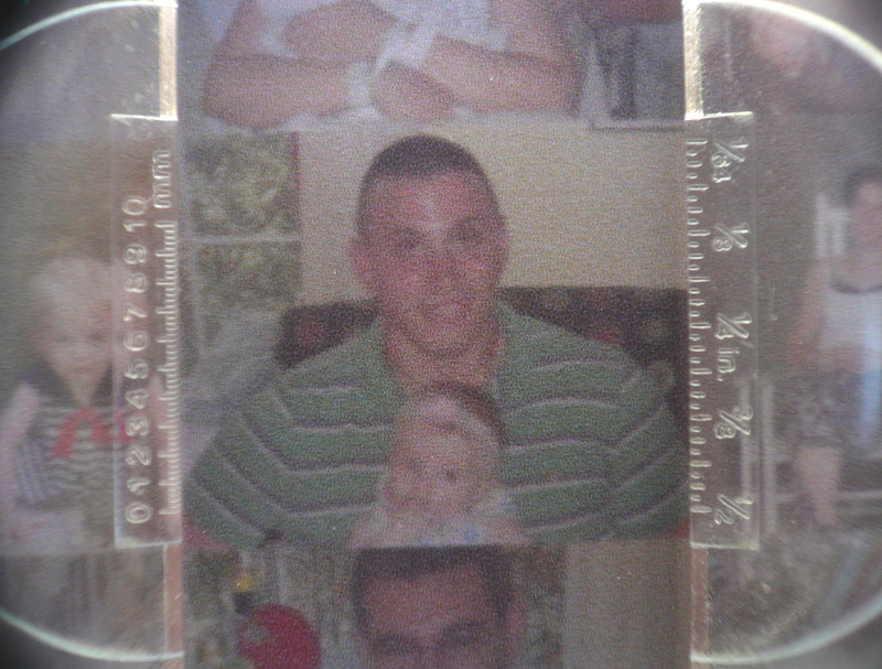
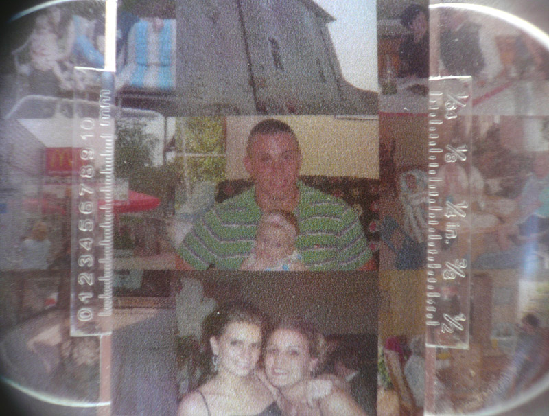
Super Close Up Views: In the views below, we use a 10x Loreo Lubot (a photographer magnification lens) to explore the actual print resolution (dpi) of each mosaic. The greater the dpi (dots per inch), the clearer and sharper each cell photo can be. The results are pretty clear (no pun intended).
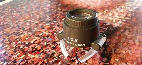
Above: Our 10x Loreo Lubot to study the print reolstuion (dpi) of each mosaic.
We wanted to create a review process that was completely impartial and unbiased. Using the same target source image and cells, we chose the top four photo mosaic design companies and online photo mosaic tools. We recorded our experiences with each company and online tool along with the quality of their mosaic results.
To be considered for review, each company and app had to meet the following criteria:
1) A listing that appears in the first three pages of Google or Yahoo search results for the term “photo mosaic” or “picture mosaic” OR appear in a “sponsored listings” section of either of these search engines.
2) Reasonable pricing. Equal to or less than $300.00 (USD) for a mosaic product with a print size of approximately 18″x24″
3) Offer online ordering.
The following source images were used for our review:

Photo Mosaic Designer Source Image
|
 Online Photo Mosaic Tool Source Image
|
We were looking for somewhat complicated source images, however not too complicated that it would be impossible to create a quality mosaic. We chose photos with people to test the facial recognition abilities of each mosaic company and app.
We also used with the same 400 cell photos to create each mosaic, here is a small sample of the cell photos we submitted: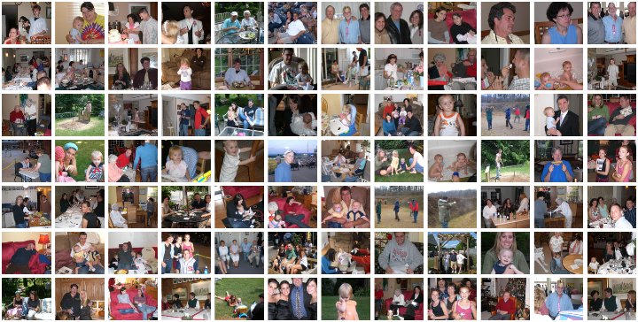
After a few weeks, we had recorded our experiences with each company and online tool and fully analyzed the final mosaic results.
Check out our “Design Services” and “Software & Tools” pages for our full reviews. If you or anyone else has used one of these services, please feel free to write your own review! Hopefully these reviews are helpful in selecting the mosaic service that’s right for you.
